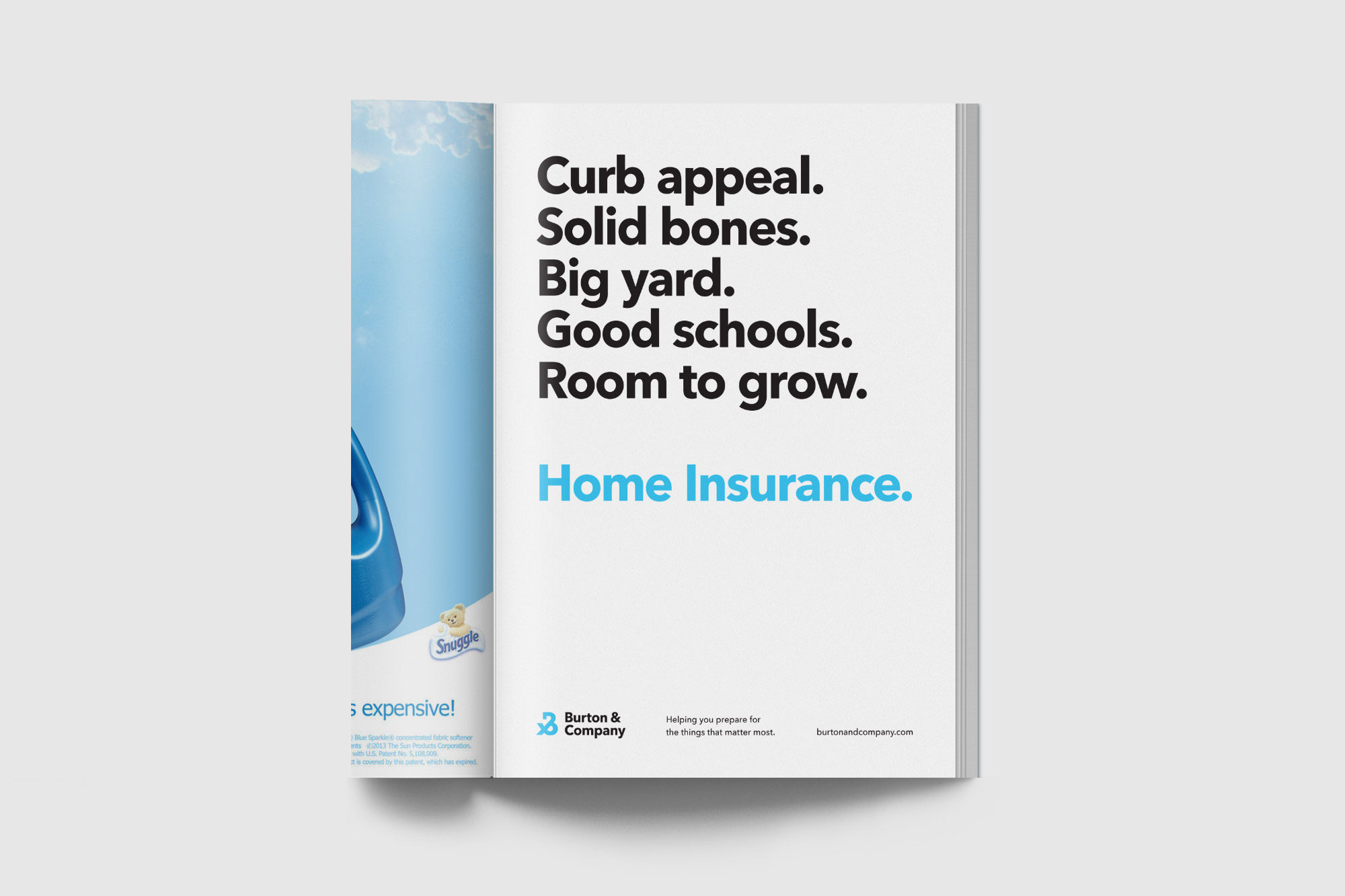
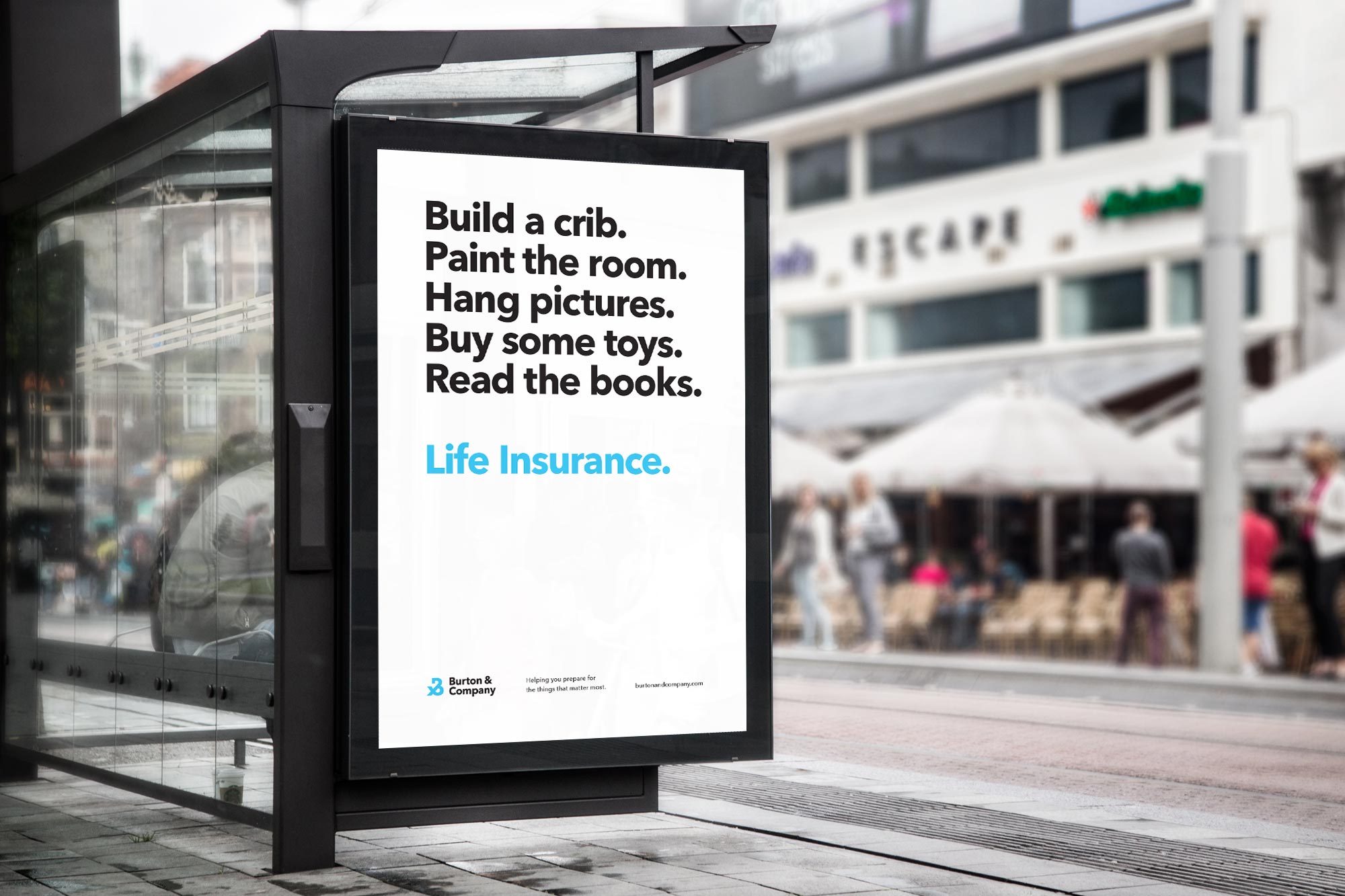
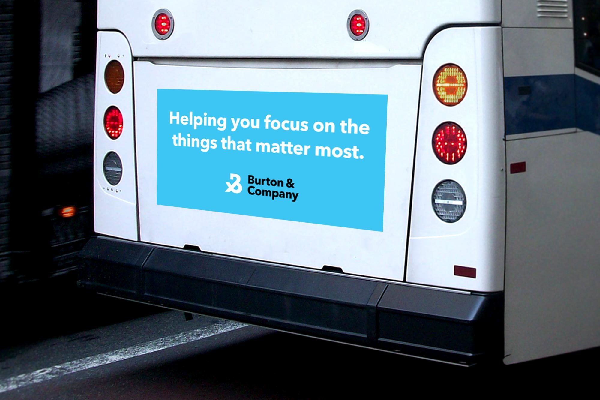
It’s all about the ‘And’
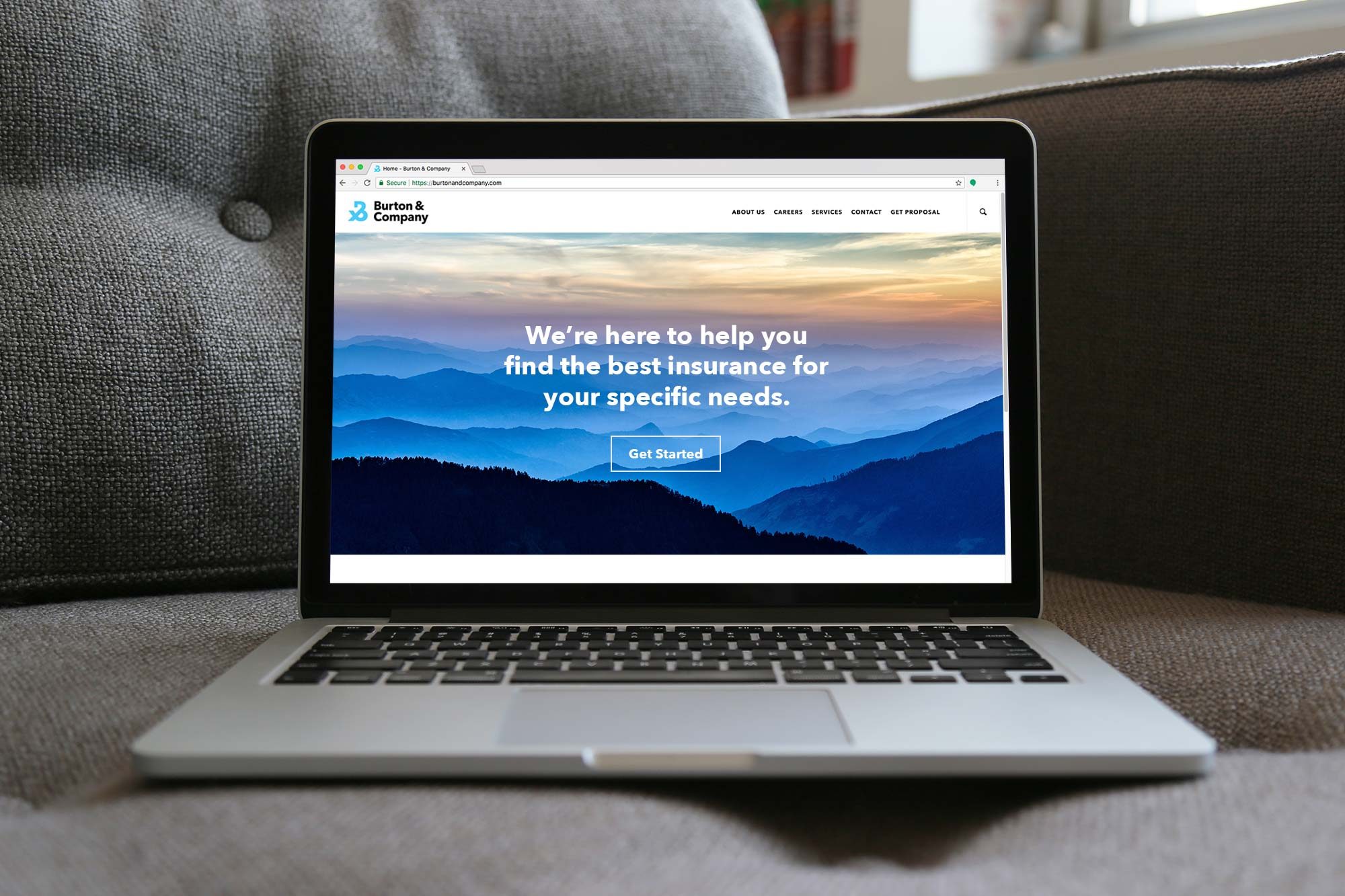
Burton & Company, formerly Burch, Hodges and Stone, a community-first insurance brokerage spanning multiple states and independent branches, approached our firm for a rebrand that would unite all of their locations and services under one cohesive identity. Burton & Company encourages experiences, focusing on the importance of a life full of family, friends and community. An essential component of the rebrand was to communicate the importance of inclusiveness and community at the core of Burton & Company, a trusted business established in 1891.
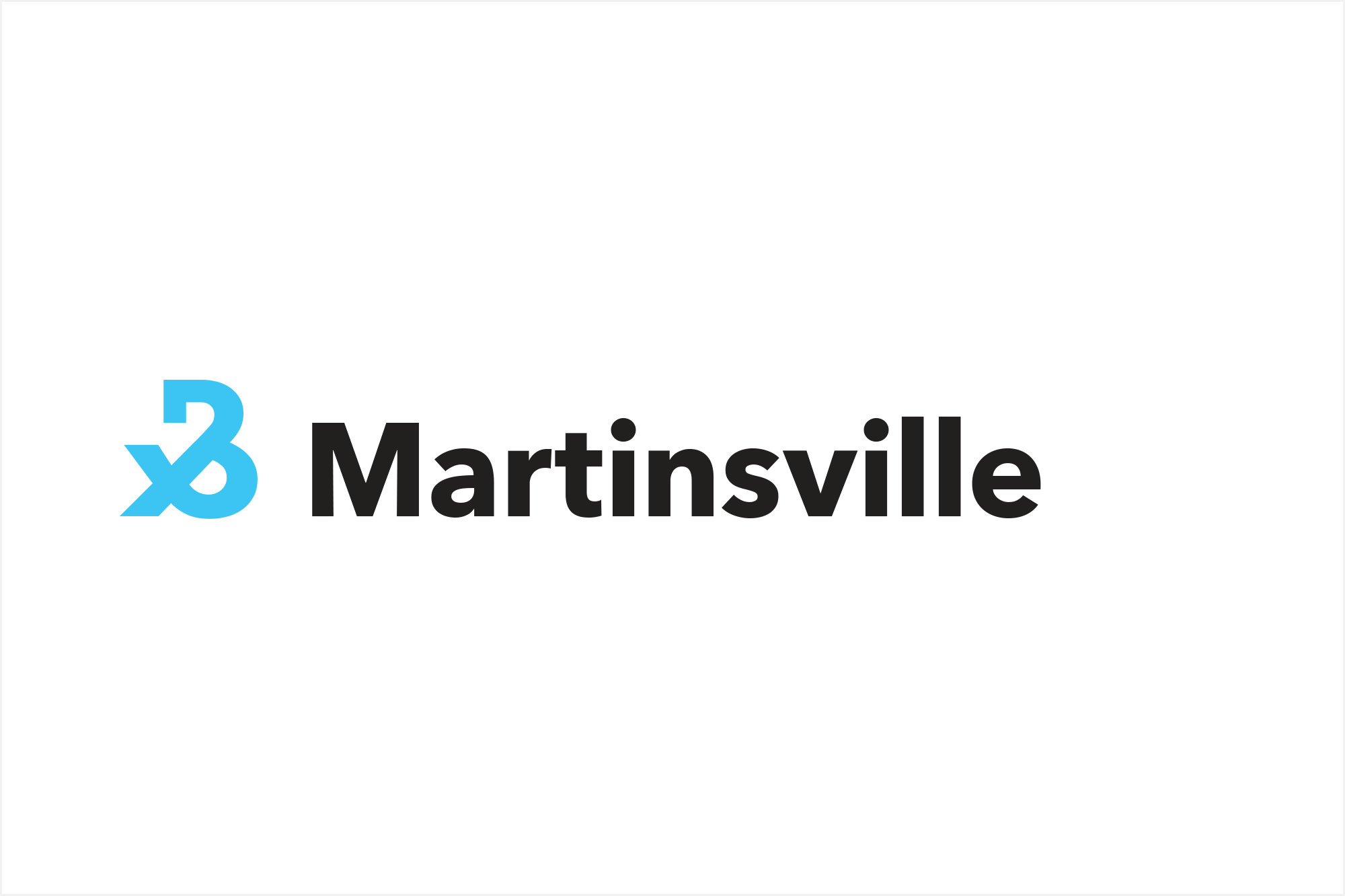
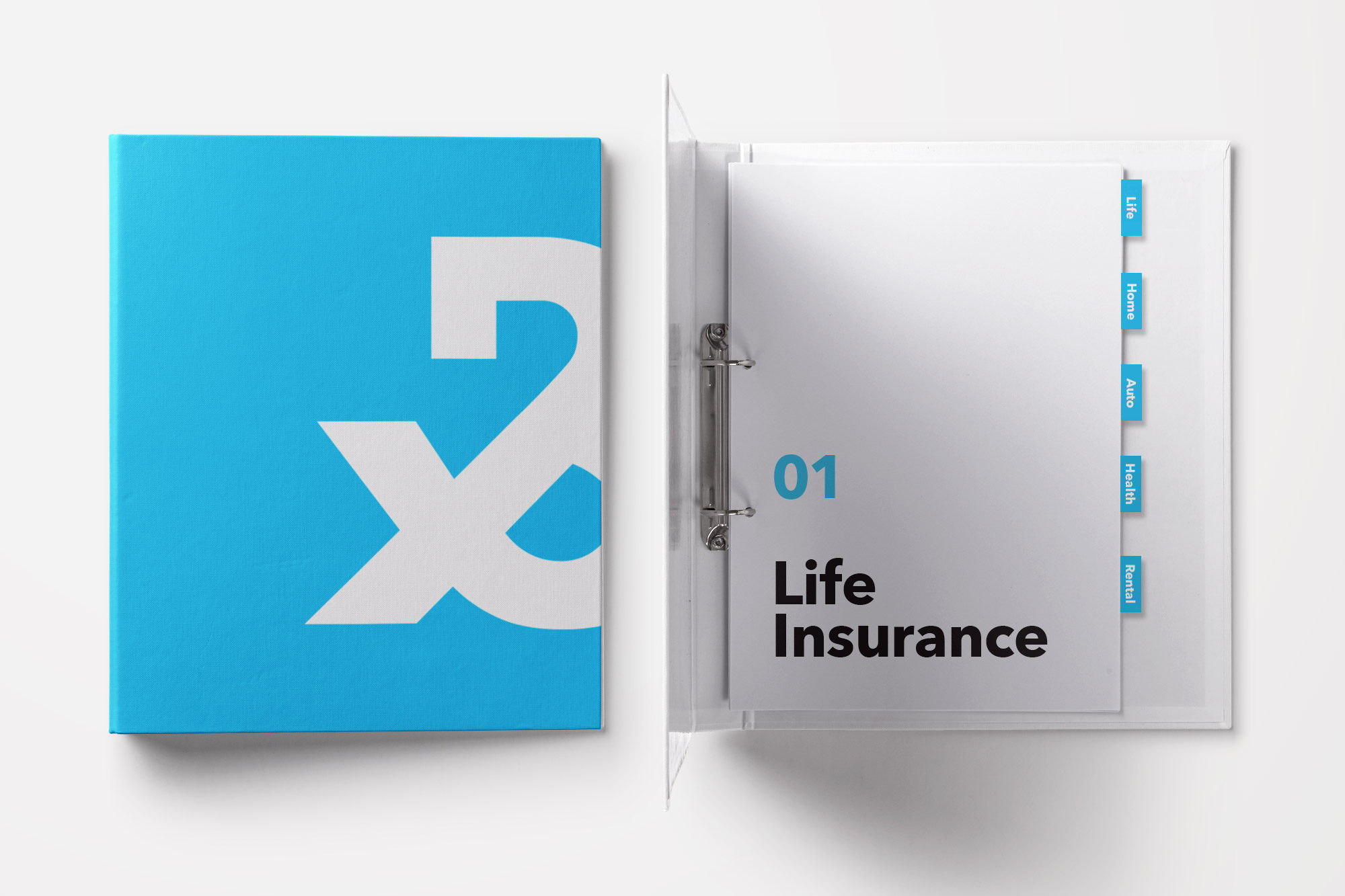
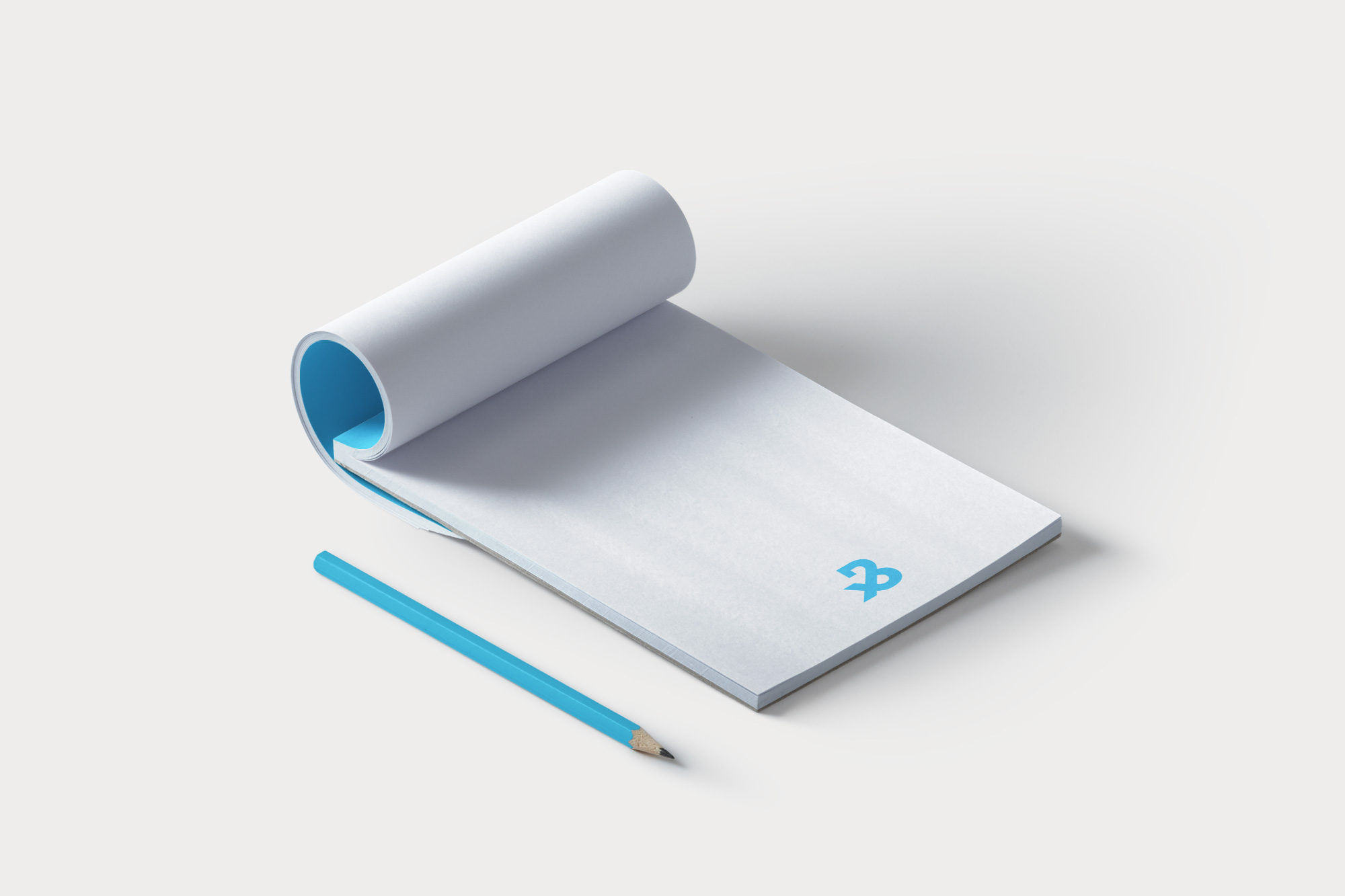
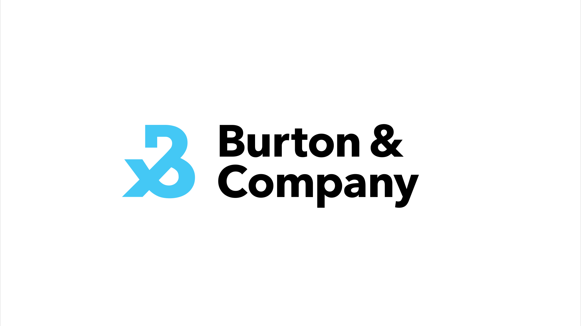
We worked with the company president, Robby Burton, to establish the core principles and brand voice to construct the identity from the ground up. The ownable ampersand mark inherits characteristics from both the letter “B” and the “&” in Burton & Company, reading as a unique letterform that’s bold and all-inclusive. This pairing of elements speaks to the relationships, customization, and community focus of Burton & Company’s insurance offerings.


The team at Selman exceeded my expectations at every step along the way. I consider them a key part of our team.”
SELMAN TEAM
Anne Di Lillo
Christopher Schroeder
Jessica Barbon
Johnny Selman
Stephen Lim
CLIENT TEAM
Robby Burton